People often ask me how I make my figures. Here is a recent example from a talk given at O’Reilly’s Strata conference in London:

So the short version is, I use an iPad Pro with an Apple Pencil and the Paper by Fifty Three app. The app is pretty minimalistic, but the pens just look awesome. If you look closely, there is something about how the lines start with a slight dot, and they are very dynamic. The watercolors look very nice, too.
The feature I miss most are layers. For example, if I am not sure about the colors, it would be nice to have the outlines in one layer and the watercolor in another so that I can remove them if I want to.
The second runner up is the Tayasui Sketches. Still fairly minimalistic, but it has layers and is generally a bit more flexible. But the lines look more clean. In the end, you will have to see what works for you. If you are looking for pure vector format app, have a look at Concepts by TopHatch.
The Pencil is not absolutely necessary. I just used my fingers or one of those tablet pens for a long while. You only need to zoom in when you want to write, but otherwise it works just as easily.
To get the sketch off the iPad, I usually share it to Desktop or Google Drive and then include it from there.
But why?
To be honest, the first time I sketched slides by hand was because I didn’t have enough time. So I just drew slides by hand, took photos and post-processed to make them white/black. The first response were good, and I liked the process, so I kept doing it.
For a while, the process involved sketching the figures on paper, taking a photo, post-processing in GIMP or inkscape. My old blog has a number of such examples.
I think one of the main reason why people respond to these slides is that the irregularity is much more interesting than the perfectly aligned PowerPoint boxes. One could even say that these hand drawn lines carry some emotions. You can tell which parts were hastily drawn, and where I struggled, and that probably makes things more interesting.
More Thoughts On Figures
I personally think that figures are an integral part of your presentations, as they help to visualize and anchor things you have said. If you say too many things that are unrelated to anything on your slides, people will have a hard time remembering.
The real challenge is that the figure needs to speak for itself more or less. You don’t have time or space to put every little detail in there.
I try to organize the information in a way that represents some well known process in the real world. The idea is that the figure should look like something you know, for example, cars in streets, conveyor belts in a factory, or people queuing at a bank. If you find the right visual metaphor, people will have a much better time figuring out what you want to tell them.
Some examples to illustrate:

This is a figure I use to show roughly how recommendation works. The customer looks at his screen and sees an article. The article has attributes, and the actions go into a database (named “logs”). They both end up in a “mystery box” with the gears, and end up in another database (named “reco”) from where the articles flow back to the customer.
I am using a number of standard shapes here, like the person, the screen, and the drum like shape for the database. You don’t have to be an artist, just keep it consistent.
I think I also subconsciously made the flow of articles at the top look a bit like a conveyor belt, which I associate with something automated that runs at a certain speed. Makes total sense to me here.

This is one of the more complex figures I used to explain how data science goes into production. It is pretty busy, so let’s go one by one.
If you follow the arrows, this essentially looks like a closed loop, which is also what I want to stress. In addition I used the dashed lines to group the different parts of the figure. There is an arrow (in another color) between A/B Testing and Evaluate to say that these two parts relate to one another. The data science box looks like some other figure I had a few slides before that, also using the same colors to make them easier to recognize.
I think in general that colors can be used to subconsciously group different parts. Somehow, we pick up these non-verbal clues very easily and they make the figure easier to parse.
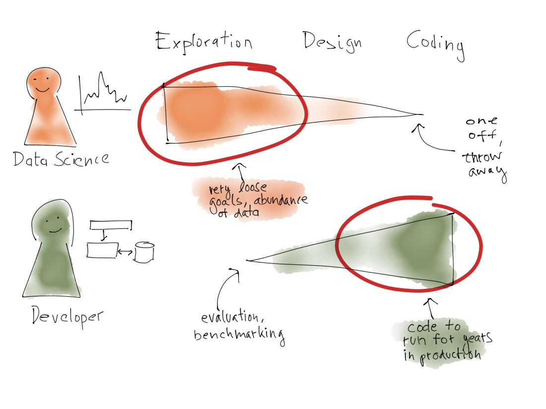 Here is another example where I compare the work of data scientists and developers. I used colors to make clear what belongs to what. I had the same people shape for the two roles, but added either a function plot or a small boxes-and-arrow plot as a superscript to distinguish the roles. It looks a bit as if they are standing before these drawings on the wall, or like a superscript.
The right hand side of the figure is organized like a table with different columns (“Exploration”, “Design”, “Coding”), but I then use these triangular shapes to denote where the work focusses, and also used the red highlighting which looks like correction marks to highlight what is interesting.
The way to have the two objects to be compared lined up also is something we would do in real life.
The figure was taken from a talk which later became a blog post. You can see there that I tried using the red = data scientist, green = developer encoding consistent across a few slides. I don’t know if anyone noticed, but I tend to believe it helped people to understand the slides faster.
Just Try It Out
As you see, there is a lot of non-verbal, half-baked thinking going into these slides. It is not clear cut, but it also doesn’t matter. I think that our perception is using a lot of these short-cuts like looking for things which are aligned, or have the same color, and using these effects help people to pick up faster what you mean.
I think I learned a lot of this from countless discussions at a whiteboard. It is an exercise in the same thing: laying out ideas and how they relate to one another in a two-dimensional space. I can only invite you to try using whiteboards more. They can help to ground the discussion, give you something to point to, and keep you from running around in circles.
To be honest, I don’t know for each figure whether people really got them or whether they are too complicated, but I get positive feedback occasionally, so I hope they do what I think they do 😉
By the way, in my experience, the only time you should not use hand written slides is when you know you will need to change them later on. PowerPoint boxes are a better choice then!
Let me know what you think and sent me examples of your figures in the comments!
